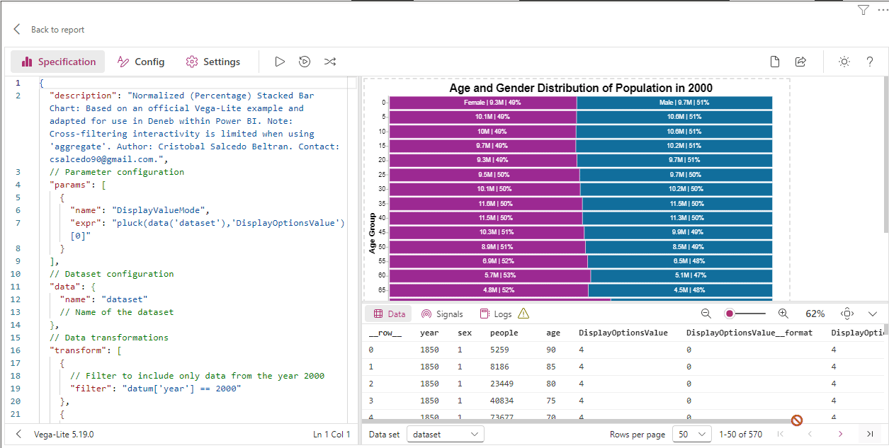
Normalized (Percentage) Stacked Bar Chart With Dynamic Labels
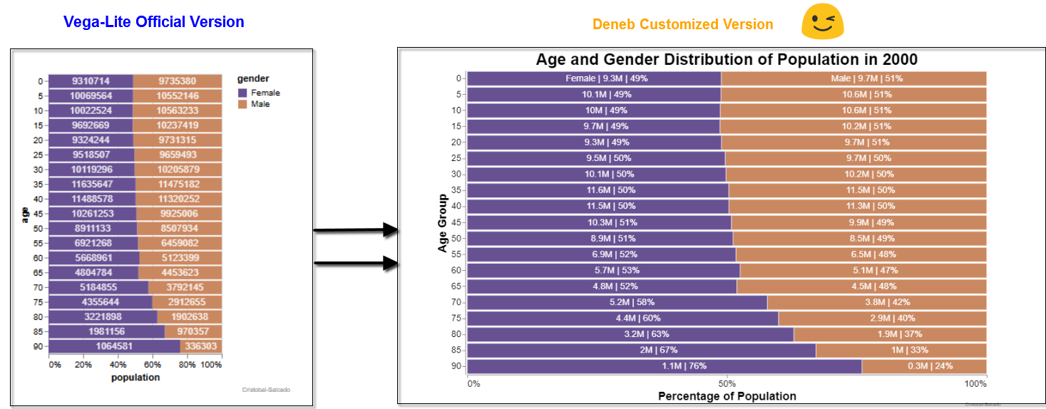
This template for a Normalized (Percentage) Stacked Bar Chart With Dynamic Labels is adapted from the official Vega-Lite example and customized for Deneb in Power BI. Enhancements include the addition of labels and a descriptive title. Note that cross-filtering interactivity is not possible due to the use of the ‘aggregate’ function.
Introduction
In this delivery, I want to highlight that we are launching a new version of Deneb. One of the significant advantages of this update is that it now allows adding comments in the code, which is extremely useful for documenting and keeping a clear record of all our modifications and developments.
Additionally, I have made the following improvements:
- Percentage Labels:
- Labels showing the percentage of each segment within the bars have been added, making data interpretation easier. These labels can be shown or hidden according to the user’s selection using the “ShowPercentageValues” option.
- Absolute Labels:
- In addition to the percentage, labels with absolute values (in millions) have been included, providing precise numerical references. These labels can also be shown or hidden according to the user’s preference using the “ShowAbsoluteValues” option.
- Dynamic Label Options:
- The chart offers dynamic options for label visualization. Users can choose to display only absolute values, only percentages, both values, or full detailed values using the “ShowAbsoluteValues”, “ShowPercentageValues”, “ShowBothValues”, and “ShowFullValues” options respectively. This flexibility allows for a personalized and suitable visualization for different analytical needs.
Selection Parameters:
- ShowAbsoluteValues: Displays only the absolute values of each segment.
- ShowPercentageValues: Displays only the percentage values of each segment.
- ShowBothValues: Displays both absolute and percentage values.
- ShowFullValues: Displays full and detailed values, both absolute and percentage.
This detailed description provides a clear understanding of the functionalities and dynamic options available in the chart, enhancing the interpretation and adaptability of the presented data.
👀
Download the files used here
- 🔽 Normalized_Percentage_Stacked_Bar_Chart_With_Dynamic_Labels.pbix (2.68 MB)
- 🔽 Template_Normalized_Percentage_Stacked_Bar_Chart_With_Dynamic_Labels.json ( 8.65 KB)
References
- Deneb Official Website: Official website for Deneb, providing comprehensive resources and documentation.
- Vega-Lite Normalized (Percentage) Stacked Bar Chart With Dynamic Labels Example: This example illustrates a Horizontal Stacked Bar Chart using Vega-Lite, serving as a foundational guide for creating complex visualizations.
- Advanced Options for the pbiFormat Function: A detailed guide on using the pbiFormat function for advanced formatting options.
- Formatting in Deneb: A comprehensive resource on formatting techniques in Deneb.
- Schemes in Deneb: Insights into various schemes available in Deneb, helping to customize and enhance the visual appeal of your charts.
- Categorical Schemes: Information on categorical schemes in Vega, useful for categorization and visual differentiation in charts.
Copy the Template Below👇✔
{
  "$schema": "https://vega.github.io/schema/vega-lite/v5.json",
  "usermeta": {
    "information": {
      "uuid": "36599ca9-ab84-492b-ad10-3ab310179e16",
      "generated": "2024-08-08T04:25:18.675Z",
      "previewImageBase64PNG": "data:image/png;base64,iVBORw0KGgoAAAANSUhEUgAAAAEAAAABCAQAAAC1HAwCAAAAC0lEQVR42mNkYAAAAAYAAjCB0C8AAAAASUVORK5CYII=",
      "name": "Normalized (Percentage) Stacked Bar Chart With Dynamic Labels",
      "description": "Normalized (Percentage) Stacked Bar Chart With Dynamic Labels: Based on an official Vega-Lite example and adapted for use in Deneb within Power BI. Note: Cross-filtering interactivity is limited when using 'aggregate'. Author: Cristobal Salcedo Beltran. Contact: csalcedo90@gmail.com.",
      "author": "Cristobal Salcedo Beltran"
    },
    "deneb": {
      "build": "1.7.0.0",
      "metaVersion": 1,
      "provider": "vegaLite",
      "providerVersion": "5.19.0"
    },
    "interactivity": {
      "tooltip": true,
      "contextMenu": true,
      "selection": false,
      "selectionMode": "simple",
      "highlight": false,
      "dataPointLimit": 50
    },
    "config": "{\n  // View configuration: remove default stroke for cleaner appearance\n  \"view\": {\n    \"stroke\": \"transparent\"\n  },\n  // Y-axis configuration\n  \"axisY\": {\n    \"grid\": false, // Disable grid lines for a cleaner look\n    \"offset\": 3, // Offset to position the axis labels slightly away from the axis\n    \"labelAngle\": 0, // Angle of the y-axis labels (horizontal)\n    \"labelFontSize\": 14, // Font size of y-axis labels\n    \"titleFontSize\": 18 // Font size of the y-axis title\n  },\n  // X-axis configuration\n  \"axisX\": {\n    \"grid\": false, // Disable grid lines for a cleaner look\n    \"labelAngle\": 0, // Angle of the x-axis labels (horizontal)\n    \"labelFontSize\": 14, // Font size of x-axis labels\n    \"tickCount\": 3, // Number of ticks on the x-axis for simplicity\n    \"titleFontSize\": 18 // Font size of the x-axis title\n  },\n  // Legend configuration\n  \"legend\": {\n    \"title\": \"\", // No title for the legend\n    \"symbolSize\":  {\"expr\": \"DisplayValueMode==4?0:280\"}, // Size of the symbols in the legend\n    \"disable\": false, // Ensure legend is enabled\n    \"labelFontSize\": {\"expr\": \"DisplayValueMode==4?0:14\"}, // Font size of legend labels\n    \"labelFontWeight\": \"bold\", // Bold font for legend labels\n    \"columnPadding\": 80, // Padding between legend columns\n    \"labelColor\": {\n      \"expr\": \"datum.label == 'Male' ? '#116e9d' : '#9d2993'\" // Conditional color for labels\n    },\n    \"orient\": \"right\", // Position the legend at the top\n    \"labelAlign\": \"left\" // Align legend text to the left of the symbol\n  }\n}",
    "dataset": [
      {
		"key": "__0__",
		"name": "Time Period",
		"description": "The specific year or time frame the data represents.",
		"kind": "column",
		"type": "numeric"
	  },
	  {
		"key": "__1__",
		"name": "Category Code",
		"description": "A numeric code representing different categories such as gender, region, or type.",
		"kind": "column",
		"type": "numeric"
	  },
	  {
		"key": "__2__",
		"name": "Quantity",
		"description": "The numerical count or measurement of items in a particular group or category.",
		"kind": "column",
		"type": "numeric"
	  },
	  {
		"key": "__3__",
		"name": "Classification",
		"description": "The grouping or classification such as age range, income bracket, or type.",
		"kind": "column",
		"type": "numeric"
	  },
      {
        "key": "__4__",
        "name": "DisplayOptionsValue",
        "description": "Parameter to select the mode of value display in the chart: 1 for absolute values, 2 for percentage values, 3 for both values, and 4 full values",
        "kind": "measure",
        "type": "numeric"
      }
    ]
  },
  "description": "Normalized (Percentage) Stacked Bar Chart With Dynamic Labels: Based on an official Vega-Lite example and adapted for use in Deneb within Power BI. Note: Cross-filtering interactivity is limited when using 'aggregate'. Author: Cristobal Salcedo Beltran. Contact: csalcedo90@gmail.com.",
  // Parameter configuration
  "params": [
    {
      "name": "DisplayValueMode",
      "expr": "pluck(data('dataset'),'DisplayOptionsValue')[0]"
    }
  ],
  // Dataset configuration
  "data": {
    "name": "dataset"
    // Name of the dataset
  },
  // Data transformations
  "transform": [
    {
      // Filter to include only data from the year 2000
      "filter": "datum['__0__'] == 2000"
    },
    {
      // Create a new field 'gender' based on the 'sex' value
      "calculate": "datum['__1__'] == 2 ? 'Female' : 'Male'",
      "as": "gender"
    }
  ],
  // Encoding configuration for the chart
  "encoding": {
    // X-axis configuration for age groups
    "x": {
      "aggregate": "sum",
      "field": "__2__",
      "stack": "normalize",
      // Normalize to show percentage
      "title": "Percentage of Population"
    },
    // Y-axis configuration for percentage of population
    "y": {
      "field": "__3__",
      "title": "Age Group"
    },
    // Color encoding for gender differentiation
    "color": {
      "field": "gender",
      "scale": {
        "range": [
          "#9d2993",
          "#116e9d"
        ]
        // Colors for Female and Male
      }
    }
  },
  // Layer configuration for the chart elements
  "layer": [
    {
      // Configuration for the bar marks
      "mark": {
        "type": "bar",
        "opacity": 1,
        "stroke": "white",
        // White stroke for bar separation
        "strokeWidth": 0.5
      }
    },
    {
      // Configuration for the text labels
      "mark": {
        "type": "text",
        "fontSize": 14
      },
      "transform": [
        {
          // Calculate the total population per age group
          "window": [
            {
              "field": "__2__",
              "op": "sum",
              "as": "TotalPopulationPerAgeGroup"
            }
          ],
          "frame": [
            null,
            null
          ],
          "groupby": [
            "__3__"
          ]
        },
        {
          // Calculate the total population per gender and age group
          "window": [
            {
              "field": "__2__",
              "op": "sum",
              "as": "TotalPopulationPerGenderAge"
            }
          ],
          "frame": [
            null,
            null
          ],
          "groupby": [
            "gender",
            "__3__",
            "TotalPopulationPerAgeGroup",
            "__1__"
          ]
        },
        {
          // Calculate the percentage of population for each gender per age group
          "calculate": "pbiFormat(datum.TotalPopulationPerGenderAge/datum.TotalPopulationPerAgeGroup,'0%')",
          "as": "percentageOfPopulation"
        },
        {
          // Format the total population per gender for display
          "calculate": "pbiFormat(datum.TotalPopulationPerGenderAge,'#,0,,.#M')",
          "as": "formattedTotalPopulation"
        },
        {
          // Concatenate gender, percentage, and total population for label display
          "calculate": "datum.gender + '_' + datum.formattedTotalPopulation +  ' | ' +  datum.percentageOfPopulation ",
          "as": "labelTextFirst"
        },
        {
          // Concatenate gender, percentage, and total population for label display
          "calculate": "DisplayValueMode==4? (datum['__3__']=='0'?datum.gender + ' | ' + datum.formattedTotalPopulation +  ' | ' +  datum.percentageOfPopulation: datum.gender + '_' + datum.formattedTotalPopulation +  ' | ' +  datum.percentageOfPopulation ): datum.labelTextFirst",
          "as": "labelText"
        }
      ],
      "encoding": {
        "color": {
          "value": "white"
          // White text for contrast
        },
        "text": {
          "value": {
            "expr": "DisplayValueMode==1? split(split(datum.labelText,'_')[1],'|')[0]: DisplayValueMode==2? split(datum.labelText,'|')[1]: DisplayValueMode==3? split(datum.labelText,'_')[1]: datum['__3__']=='0'? datum.labelText: split(datum.labelText,'_')[1]"
            // Extract the percentage and total population for text
          }
        },
        // Position text labels in the middle of the bars
        "x": {
          "aggregate": "sum",
          "field": "__2__",
          "type": "quantitative",
          "stack": "normalize",
          "bandPosition": 0.55
        },
        "detail": {
          "field": "labelText"
          // Detail field to uniquely identify text labels
        }
      }
    }
  ],
  // Title configuration for the chart
  "title": {
    "text": "Age and Gender Distribution of Population in 2000",
    // Chart title
    "fontSize": 25,
    "fontWeight": "bold",
    "fontStyle": "arial"
  }
}