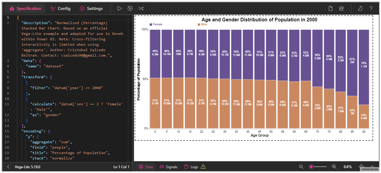
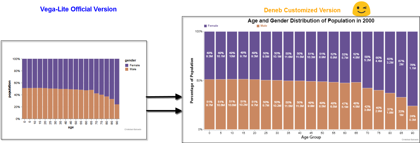
Normalized (Percentage) Stacked Bar Chart Template
This template for a Normalized (Percentage) Stacked Bar Chart is adapted from the official Vega-Lite example and customized for Deneb in Power BI. Enhancements include the addition of labels and a descriptive title. Note that cross-filtering interactivity is not possible due to the use of the ‘aggregate’ function.
Introduction
In this delivery, I want to highlight that we are launching a new version of Deneb. One of the significant advantages of this update is that it now allows adding comments in the code, which is extremely useful for documenting and keeping a clear record of all our modifications and developments.
Additionally, I have made the following improvements:
- Percentage Labels:
- Labels showing the percentage of each segment within the bars have been added, making data interpretation easier.
- Absolute Labels:
- In addition to the percentage, labels with absolute values (in millions) have been included, providing precise numerical references.
- Legend Position Change:
- Legends have been repositioned to the top-right corner to improve the visibility and organization of the chart.
- Color has been added to the legend text to match the colors used in the chart, enhancing clarity and aesthetics.
- Angle of X-Axis Labels:
- The angle of the labels on the x-axis has been adjusted to zero degrees, making the age group labels easier to read.
👀
Download the files used here
- 🔽 Normalized_Percentage_Stacked_Bar_Chart.pbix (2 MB)
- 🔽 Template_Normalized_Percentage_Stacked_Bar_Chart.json (7.49 KB)
References
- Deneb Official Website: Official website for Deneb, providing comprehensive resources and documentation.
- Vega-Lite Normalized (Percentage) Stacked Bar Chart Example: This example illustrates a Horizontal Stacked Bar Chart using Vega-Lite, serving as a foundational guide for creating complex visualizations.
- Advanced Options for the pbiFormat Function: A detailed guide on using the pbiFormat function for advanced formatting options.
- Formatting in Deneb: A comprehensive resource on formatting techniques in Deneb.
- Schemes in Deneb: Insights into various schemes available in Deneb, helping to customize and enhance the visual appeal of your charts.
- Categorical Schemes: Information on categorical schemes in Vega, useful for categorization and visual differentiation in charts.
Copy the Template Below👇✔
 {
  "$schema": "https://vega.github.io/schema/vega-lite/v5.json",
  "usermeta": {
    "information": {
      "uuid": "47a1e0ae-1ecf-43b7-b3c1-b4cf3a82301e",
      "generated": "2024-08-01T02:06:19.476Z",
      "previewImageBase64PNG": "data:image/png;base64,iVBORw0KGgoAAAANSUhEUgAAAAEAAAABCAQAAAC1HAwCAAAAC0lEQVR42mNkYAAAAAYAAjCB0C8AAAAASUVORK5CYII=",
      "name": "Normalized (Percentage) Stacked Bar Chart",
      "description": "Normalized (Percentage) Stacked Bar Chart: Based on an official Vega-Lite example and adapted for use in Deneb within Power BI. Note: Cross-filtering interactivity is limited when using 'aggregate'. Author: Cristobal Salcedo Beltran. Contact: csalcedo90@gmail.com",
      "author": "Cristobal Salcedo Beltran"
    },
    "deneb": {
      "build": "1.7.0.0",
      "metaVersion": 1,
      "provider": "vegaLite",
      "providerVersion": "5.19.0"
    },
    "interactivity": {
      "tooltip": true,
      "contextMenu": true,
      "selection": false,
      "selectionMode": "simple",
      "highlight": false,
      "dataPointLimit": 50
    },
    "config": "{\n  // View configuration: remove default stroke for cleaner appearance\n  \"view\": {\n    \"stroke\": \"transparent\"\n  },\n  // X-axis configuration\n  \"axisX\": {\n    \"grid\": false, // Disable grid lines for a cleaner look\n    \"offset\": 3, // Offset to position the axis labels slightly away from the axis\n    \"labelAngle\": 0, // Angle of the x-axis labels (horizontal)\n    \"labelFontSize\": 14, // Font size of x-axis labels\n    \"titleFontSize\": 18 // Font size of the x-axis title\n  },\n  // Y-axis configuration\n  \"axisY\": {\n    \"grid\": false, // Disable grid lines for a cleaner look\n    \"labelAngle\": 0, // Angle of the y-axis labels (horizontal)\n    \"labelFontSize\": 14, // Font size of y-axis labels\n    \"tickCount\": 3, // Number of ticks on the y-axis for simplicity\n    \"titleFontSize\": 18 // Font size of the y-axis title\n  },\n  // Legend configuration\n  \"legend\": {\n    \"title\": \"\", // No title for the legend\n    \"symbolSize\": 180, // Size of the symbols in the legend\n    \"disable\": false, // Ensure legend is enabled\n    \"labelFontSize\": 14, // Font size of legend labels\n    \"labelFontWeight\": \"bold\", // Bold font for legend labels\n    \"columnPadding\": 180, // Padding between legend columns\n    \"labelColor\": {\n      \"expr\": \"datum.label == 'Male' ? '#116e9d' : '#9d2993'\" // Conditional color for labels\n    },\n    \"orient\": \"top\", // Position the legend at the top\n    \"labelAlign\": \"left\" // Align legend text to the left of the symbol\n  }\n}",
	"dataset": [
	  {
		"key": "__0__",
		"name": "Time Period",
		"description": "The specific year or time frame the data represents.",
		"kind": "column",
		"type": "numeric"
	  },
	  {
		"key": "__1__",
		"name": "Category Code",
		"description": "A numeric code representing different categories such as gender, region, or type.",
		"kind": "column",
		"type": "numeric"
	  },
	  {
		"key": "__2__",
		"name": "Quantity",
		"description": "The numerical count or measurement of items in a particular group or category.",
		"kind": "column",
		"type": "numeric"
	  },
	  {
		"key": "__3__",
		"name": "Classification",
		"description": "The grouping or classification such as age range, income bracket, or type.",
		"kind": "column",
		"type": "numeric"
	  }
	]
  },
  // Description of the chart
  "description": "Normalized (Percentage) Stacked Bar Chart: Based on an official Vega-Lite example and adapted for use in Deneb within Power BI. Note: Cross-filtering interactivity is limited when using 'aggregate'. Author: Cristobal Salcedo Beltran. Contact: csalcedo90@gmail.com.",
  // Dataset configuration
  "data": {
    "name": "dataset"
    // Name of the dataset
  },
  // Data transformations
  "transform": [
    {
      // Filter to include only data from the year 2000
      "filter": "datum['__0__'] == 2000"
    },
    {
      // Create a new field 'gender' based on the 'sex' value
      "calculate": "datum['__1__'] == 2 ? 'Female' : 'Male'",
      "as": "gender"
    }
  ],
  // Encoding configuration for the chart
  "encoding": {
    // Y-axis configuration for percentage of population
    "y": {
      "aggregate": "sum",
      "field": "__2__",
      "stack": "normalize",
      // Normalize to show percentage
      "title": "Percentage of Population"
    },
    // X-axis configuration for age groups
    "x": {
      "field": "__3__",
      "title": "Age Group"
    },
    // Color encoding for gender differentiation
    "color": {
      "field": "gender",
      "scale": {
        "range": [
          "#9d2993",
          "#116e9d"
        ]
        // Colors for Female and Male
      }
    }
  },
  // Layer configuration for the chart elements
  "layer": [
    {
      // Configuration for the bar marks
      "mark": {
        "type": "bar",
        "opacity": 1,
        "stroke": "white",
        // White stroke for bar separation
        "strokeWidth": 0.5
      }
    },
    {
      // Configuration for the text labels
      "mark": {
        "type": "text",
        "fontSize": 14,
        "lineBreak": "|"
      },
      "transform": [
        {
          // Calculate the total population per age group
          "window": [
            {
              "field": "__2__",
              "op": "sum",
              "as": "TotalPopulationPerAgeGroup"
            }
          ],
          "frame": [
            null,
            null
          ],
          "groupby": [
            "__3__"
          ]
        },
        {
          // Calculate the total population per gender and age group
          "window": [
            {
              "field": "__2__",
              "op": "sum",
              "as": "TotalPopulationPerGenderAge"
            }
          ],
          "frame": [
            null,
            null
          ],
          "groupby": [
            "gender",
            "__3__",
            "TotalPopulationPerAgeGroup",
            "__1__"
          ]
        },
        {
          // Calculate the percentage of population for each gender per age group
          "calculate": "pbiFormat(datum.TotalPopulationPerGenderAge/datum.TotalPopulationPerAgeGroup,'0%')",
          "as": "percentageOfPopulation"
        },
        {
          // Format the total population per gender for display
          "calculate": "pbiFormat(datum.TotalPopulationPerGenderAge,'#,0,,.#M')",
          "as": "formattedTotalPopulation"
        },
        {
          // Concatenate gender, percentage, and total population for label display
          "calculate": "datum.gender + '_' + datum.percentageOfPopulation + '|' + datum.formattedTotalPopulation",
          "as": "labelText"
        }
      ],
      "encoding": {
        "color": {
          "value": "white"
          // White text for contrast
        },
        "text": {
          "value": {
            "expr": "split(datum.labelText,'_')[1]"
            // Extract the percentage and total population for text
          }
        },
        // Position text labels in the middle of the bars
        "y": {
          "aggregate": "sum",
          "field": "__2__",
          "type": "quantitative",
          "stack": "normalize",
          "bandPosition": 0.55
        },
        "detail": {
          "field": "labelText"
          // Detail field to uniquely identify text labels
        }
      }
    }
  ],
  // Title configuration for the chart
  "title": {
    "text": "Age and Gender Distribution of Population in 2000",
    // Chart title
    "fontSize": 25,
    "fontWeight": "bold",
    "fontStyle": "arial"
  }
}
Esta entrada está licenciada bajo CC BY 4.0 por el autor.