Aggregate Bar Chart With Cross Filtering
An in-depth look at the US population distribution by age in 2000 through an interactive bar chart with cross-filtering capabilities.
Aggregate Bar Chart With Cross Filtering
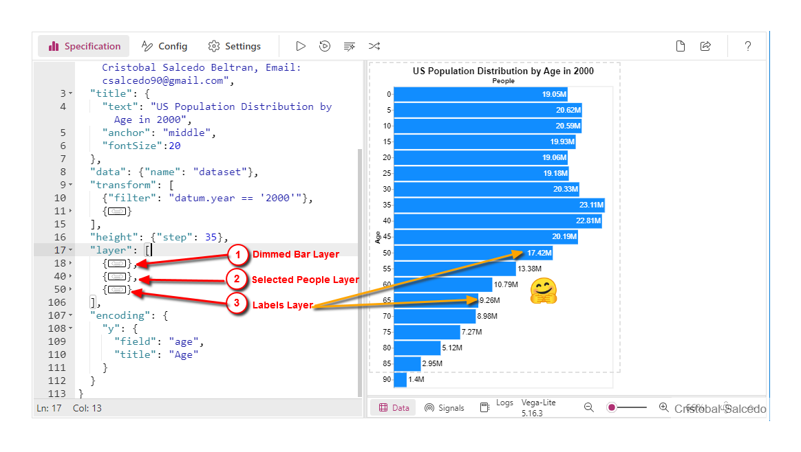
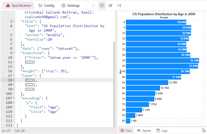
The interactive bar chart below provides a detailed visualization of the US population distribution by age groups in the year 2000. Created using Vega-Lite and adapted to Deneb in Power BI, this chart features cross-filtering capabilities and enhanced labeling for improved clarity and usability. Let’s break down the key components of this visual.
Key Layers of the Chart
1. Dimmed Bar Layer
Description: This layer displays the dimmed bars representing the total population for each age group. The bars have an opacity of 0.3 to indicate they are part of the background data, providing context for the selected data.
Purpose: To show the overall population distribution by age, providing a backdrop against which selected data can be compared.
...
{
  "description": "Dimmed Bar Layer; displays total population with opacity",
  "mark": {
    "type": "bar",
    "opacity": 0.3,
    "tooltip": true
  },
  "encoding": {
    "x": {
      "aggregate": "sum",
      "field": "people",
      "title": "People",
      "axis": {
        "titleFontSize": 30,
        "labels": false,
        "domain": false,
        "ticks": false,
        "orient": "top"
      }
    }
  }
},
...
2. Selected People Layer
Description: This layer displays the highlighted bars that represent only the selected population for each age group. These bars reflect the population that has been selected or filtered through the cross-filtering interaction.
Purpose: To highlight the selected subset of the population, allowing for focused analysis and comparison against the overall population
...
{
  "description": "Selected People Layer; displays the selected population with full opacity",
  "mark": {"type": "bar"},
  "encoding": {
    "x": {
      "aggregate": "sum",
      "field": "Selected_People"
    }
  }
},...
3. Labels Layer
Description: This layer adds labels to the bars, showing the population values. The labels are aligned to the right or left based on their position relative to the average population value, and their color changes to ensure readability.
Purpose: To provide clear, readable population values directly on the bars for easy reference, enhancing the interpretability of the data.
...
{
  "transform": [
    {
      "aggregate": [
        {
          "op": "sum",
          "field": "people",
          "as": "sumPeople"
        }
      ],
      "groupby": ["age"]
    },
    {
      "window": [
        {
          "op": "average",
          "field": "sumPeople",
          "as": "averagePeople"
        }
      ],
      "frame": [null, null]
    }
  ],
  "name": "labels",
  "description": "Labels Layer; adds population value labels to the bars",
  "mark": {
    "type": "text",
    "align": {
      "expr": "datum.sumPeople>datum.averagePeople?'right':'left'"
    },
    "dx": {
      "expr": "datum.sumPeople>datum.averagePeople?-3:3"
    },
    "color": {
      "expr": "datum.sumPeople>datum.averagePeople?'white':'black'"
    },
    "fontSize": 16
  },
  "encoding": {
    "text": {
      "value": {
        "expr": "pbiFormat(datum.sumPeople, '#,0,,.0#M')"
      }
    },
    "x": {
      "field": "sumPeople",
      "type": "quantitative",
      "axis": {
        "labels": false,
        "domain": false,
        "ticks": false,
        "grid": false
      }
    }
  }
}...
By breaking down the chart into these three layers, we can appreciate the thoughtful design that provides both an overall view and detailed insights into the population distribution. The dimmed bar layer sets the context, the selected people layer allows for focused analysis, and the labels layer enhances readability. This combination makes the chart an effective tool for visualizing demographic data.
Download the files used here
🔽 Aggregate_Bar_Chart_With_Cross_Filtering.pbix ( 2.01 MB)
🔽 Aggregate_Bar_Chart_With_Cross_Filtering.json: (4.24 KB)
Sure, here is an improved version of the references section:
References
- Vega-Lite Bar Aggregate Example: This link provides an example of an aggregate bar chart using Vega-Lite, which forms the basis for creating complex, interactive visualizations.
- Deneb Interactivity and Selection Guide: This guide explains how to implement interactivity and selection features in Deneb visualizations, enhancing the functionality and user experience of your charts.
Copy Template
{
  "$schema": "https://vega.github.io/schema/vega-lite/v5.json",
  "usermeta": {
    "deneb": {
      "build": "1.6.2.1",
      "metaVersion": 1,
      "provider": "vegaLite",
      "providerVersion": "5.16.3"
    },
    "interactivity": {
      "tooltip": true,
      "contextMenu": true,
      "selection": true,
      "highlight": false,
      "dataPointLimit": 50
    },
    "information": {
      "name": "Aggregate Bar Chart With Cross Filtering",
      "description": "Aggregate Bar Chart With Cross Filtering",
      "author": "Cristobal Salcedo Beltran",
      "uuid": "42a2a19a-f7a8-47bb-8beb-5aad66093fc7",
      "generated": "2024-06-15T05:34:29.859Z"
    },
    "dataset": [
      {
        "key": "__0__",
        "name": "year",
        "description": "",
        "type": "text",
        "kind": "column"
      },
      {
        "key": "__1__",
        "name": "age",
        "description": "",
        "type": "numeric",
        "kind": "column"
      },
      {
        "key": "__2__",
        "name": "people",
        "description": "",
        "type": "numeric",
        "kind": "column"
      },
      {
        "key": "__3__",
        "name": "sex",
        "description": "",
        "type": "numeric",
        "kind": "column"
      }
    ]
  },
  "config": {
    "bar": {
      "color": {"expr": "pbiColor(0)"}
    },
    "axisY": {
      "labelFontSize": 16,
      "titleFontSize": 15,
      "grid": false,
      "tickCount": 6
    }
  },
  "description": "Aggregate Bar Chart With Cross Filtering. A bar chart showing the US population distribution by age groups in the year 2000. Example of Vega-Lite adapted to Deneb in Power BI, with cross-filtering, labels improved with the pbiFormat function, aligned to the right and left for better visualization, in the bars with white and black color. Author: Cristobal Salcedo Beltran, Email: csalcedo90@gmail.com",
  "title": {
    "text": "US Population Distribution by Age in 2000",
    "anchor": "middle",
    "fontSize": 20
  },
  "data": {"name": "dataset"},
  "transform": [
    {
      "filter": "datum['__0__'] == '2000'"
    },
    {
      "calculate": "datum.__selected__=='off'? 0: datum['__2__']",
      "as": "Selected_People"
    }
  ],
  "height": {"step": 35},
  "layer": [
    {
      "description": "Dimmed Bar; width = sum of people",
      "mark": {
        "type": "bar",
        "opacity": 0.3,
        "tooltip": true
      },
      "encoding": {
        "x": {
          "aggregate": "sum",
          "field": "__2__",
          "title": "People",
          "axis": {
            "titleFontSize": 15,
            "labels": false,
            "domain": false,
            "ticks": false,
            "orient": "top"
          }
        }
      }
    },
    {
      "description": "Fully Opaque Bar; width = Selected_People",
      "mark": {"type": "bar"},
      "encoding": {
        "x": {
          "aggregate": "sum",
          "field": "Selected_People"
        }
      }
    },
    {
      "transform": [
        {
          "aggregate": [
            {
              "op": "sum",
              "field": "__2__",
              "as": "sumPeople"
            }
          ],
          "groupby": ["__1__"]
        },
        {
          "window": [
            {
              "op": "average",
              "field": "sumPeople",
              "as": "averagePeople"
            }
          ],
          "frame": [null, null]
        }
      ],
      "name": "labels",
      "description": "Labels",
      "mark": {
        "type": "text",
        "align": {
          "expr": "datum.sumPeople>datum.averagePeople?'right':'left'"
        },
        "dx": {
          "expr": "datum.sumPeople>datum.averagePeople?-3:3"
        },
        "color": {
          "expr": "datum.sumPeople>datum.averagePeople?'white':'black'"
        },
        "fontSize": 16
      },
      "encoding": {
        "text": {
          "value": {
            "expr": "pbiFormat(datum.sumPeople, '#,0,,.0#M')"
          }
        },
        "x": {
          "field": "sumPeople",
          "type": "quantitative",
          "axis": {
            "labels": false,
            "domain": false,
            "ticks": false,
            "grid": false
          }
        }
      }
    }
  ],
  "encoding": {
    "y": {
      "field": "__1__",
      "title": "Age"
    }
  }
}